
Rug guides
How to combine Persian rugs in one home
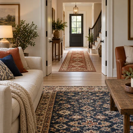
Learn how to combine Persian rugs across rooms using colour, scale and furniture to create harmony with different patterns.
CarpetDepo Rug Magazine
Several Persian rugs can be coordinated in one apartment so that the pattern and base color of the pieces are different. The connection can also be created by a recurring color, a different scale of the patterns or a conscious transition between rooms. To plan, you should first look at which rugs you see at the same time. A room behind two closed doors may require a different relationship than the dining room and foyer, which can be seen all the way from the living room.
Illustration: connection of different carpets between two rooms.
Start from the pieces you see together
Stand at the main points of view in the apartment: at the entrance, at the door of the living room and at the most frequently used seating area. Note which carpets come into your view at the same time. This way you don't have to force the same color scheme on every room. It is worth looking for a connection between the pieces that actually meet in the everyday view.
Also consider open doors and the width of passageways. Sometimes only the end of the other carpet can be seen through a narrow doorway, while with a wide opening the entire composition can be present. This visible part should be the basis of the design. Don't just put the complete product images of the separate rooms next to each other, but also examine the actual connection point.
Please check the size and product information for each room for hand-knotted Iranian Persian rugs. The common category does not mean that all pieces have the same material, thickness or handling requirements. In addition to looking for an aesthetic connection, each chosen carpet must also be suitable for its place.
Look for a connecting color, not a complete match
The base color of the two carpets may differ, while a tone close to the same returns in a smaller motif. A rusty detail of a dark blue field can connect to the reddish background of another piece. This is an illustrative color idea, not an automatic pairing of all blues and reds. You have to evaluate the real shade on specific objects and in your own rooms.
The weight of the associated color is also important. On one carpet, it can give a large surface, on the other it can only appear in a narrow frame. This makes the connection still recognizable, while the two rooms get an independent character. If all colors appear in the same proportion on both pieces, the visual can be closer to an identical set. Choose the overall effect that you like.
The common point is not necessarily created directly between two carpets. The floor or a repeating wooden piece of furniture can also connect the rooms. In this case, the textiles can be more boldly different from each other. First, name the large surfaces of the apartment that will definitely remain, and in relation to these, decide how many common colors you want on the carpets.
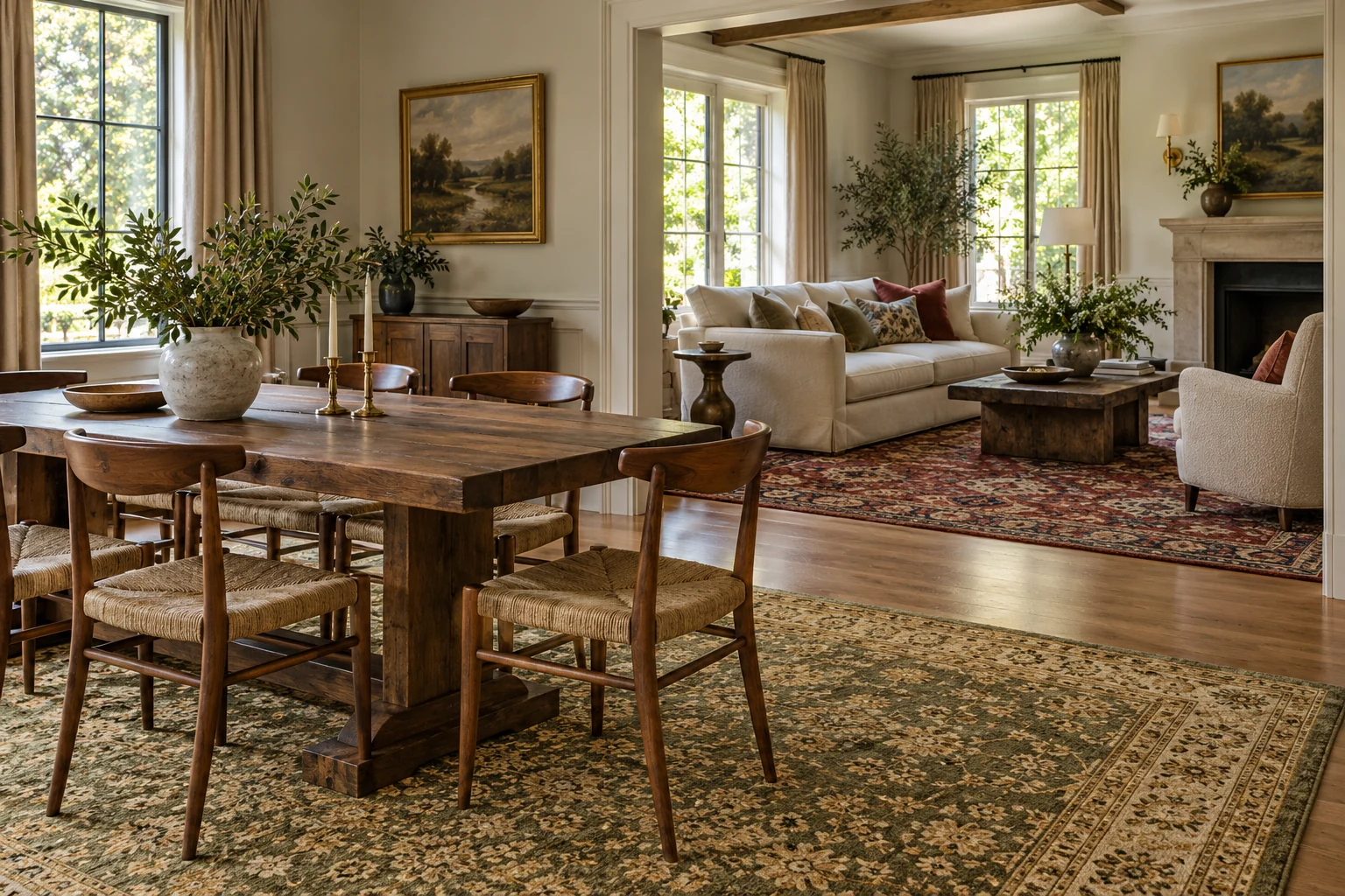
Illustration: different basic colors in a shared home environment.
A different sample scale can help clarity
The pattern scale describes how large each motif appears in relation to the entire surface. A large medallion and a small repeat can give a different rhythm. If two pieces seen next to each other are similarly detailed and dense, it is especially important to test from the point of view. A pattern can be beautiful on its own, while together creating a different effect.
One room can have a more pronounced pattern, the other a more restrained one. It is not necessary to choose the same strong central element in every room. To plan the difference, look at the furniture as well: in addition to fancy dining chairs and sectional wardrobes, a different background than a single-colored sofa and few objects may be desirable. The rhythm of the carpet can be read together with the entire environment.
From a distance, the small details can merge into a color surface, so evaluate the two carpets from the common point of view of the apartment. The door frame can partially cover a large motif or highlight a side strip. To make a decision, note not only the name of the motif, but also how much of it is visible from the other room.
Motorists should create a conscious transition
The free floor strip between the rooms can also visually separate two different carpets. You don't necessarily need to fill every transition with a third textile. If you are planning a running mat between them, check its own size, door connection and use. Its role may be to connect, but that does not automatically make any narrow piece suitable.
The end of the carpets should not be placed in an unfavorable location solely for the sake of the visual axis. Open the doors and follow the route. In the passage, the fringe, the border and the total layer thickness can also be a question. In addition to the uniform appearance of the three rooms, you must examine the operation of each placement separately.
When two rugs are placed directly next to each other, the relationship between their frames can be particularly striking. Look at the two different borders together: do they have the same density of detail, different lightness or a distinct color change? Consider this an aesthetic issue. Pushing or overlapping rugs should not be an automatic solution to proportion.
Three-room illustrative plan
Imagine a living room, dining room and office connected by open doors. In the living room, a carpet with a dark blue field, with a larger motif, with smaller red details remains. He examines a candidate for the dining room with a reddish base color and a calmer repetition. The common link here is the recurring red, while the role of the sample scale and the two large surfaces are different.
In the office, the patterned surface is only partially visible from the living room. Here, the light frame or a dull blue detail can be a sufficient point of connection. It is not necessary to bring back all the colors of the living room. Choose based on the worker's own furniture, free surface and use, and then check the strip visible from the two rooms.
The example is not a recommendation of three specific products. It shows a method for choosing common and different elements between rooms. The colors must be checked with the given pieces, and the size and suitability for handling must be checked separately. Good harmony here does not result from copying a predetermined palette, but from consistent selection criteria.
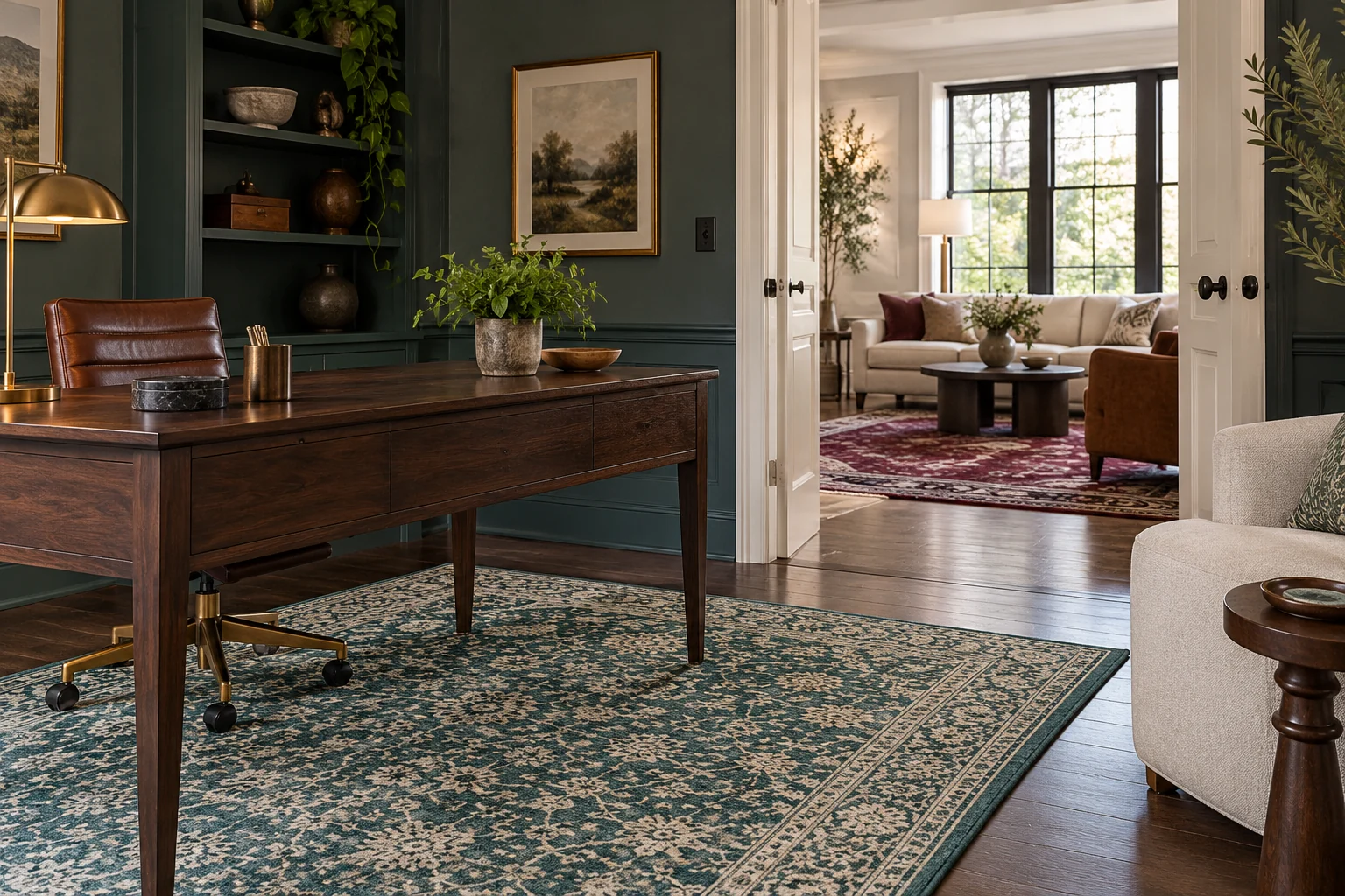
Illustration: a small color connection between the two rooms may be enough.
Try the candidates individually and together
First, choose each rug for your own room according to size and use. Then look at the relationship between them. By reversing this order, it's easy to keep a piece that fits nicely with another but is the wrong size in its own room. The harmony should be based on individual placements that work.
During the joint rehearsal, the furniture should remain in its usual place. Look at rugs in both daylight and evening lighting, as light can affect the appearance of colors. A product photo juxtaposed on a single screen is not an accurate color sample. Uncertain nuances are clarified by further information or viewing.
In the decision note, write three short sentences: which piece is the accent, what is the common color or surface, and how do they consciously differ. If these sentences consist only of product names, you should still look at the actual visuals. The wording will help you decide why you would choose the pieces together and what you only like separately.
When looking for a new piece next to an existing carpet, start from the item you have kept. Record its actual size, take an overview picture of it, and write down the colors important to the connection. Consider the new candidate for this, but don't expect him to repeat the old pattern exactly. Deviation can also be part of conscious harmony.
Frequently asked questions
Do all rugs have to be the same color?
Not necessary. A common detail or the remaining large surface of the apartment can also create a connection. Instead of a complete match, look at how the pieces look together from the vantage points between rooms.
Are two strongly patterned rugs mutually exclusive?
Not automatically. The sample scale, the visible surface and the intermediate floor strip all count. Check out the layout with the actual furniture and through the doorways and then decide according to your own taste.
Should I choose colors or sizes first?
First, clarify the appropriate size and use for each room. For the remaining candidates, it is then worth coordinating the colors and patterns seen together. A nice connection is no substitute for usable placement.
Can the treatment of different carpets be the same?
There may be similar specifications, but this must be checked separately for each piece. A common category or appellation of origin is not a complete management guide. Keep the documents linked to each product ID.
By thinking about the points of view between the rooms and the common colors, discover the offer of CarpetDepo and build a conscious connection between the chosen carpets in your home.